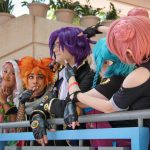
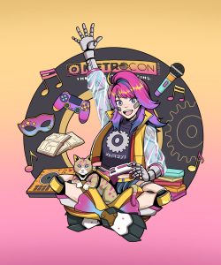
Check out our new logo up in the header, METROCON fans! You’ll see us using this new logo on our website, our merch, and all over the convention and social media this year. We wanted to not only modernize and clean-up our logo as we continue to grow and define our community even further, but we wanted to symbolize several different things with our new logo. We’ve also expanded our color palette (which you may recognize from our 20th Anniversary branding). If you’re a design geek like me, you might have picked up on a few key notes, but we love letting you in behind the scenes when we can so you can see what we’re going for when we work on things like this. Some of the things featured in our new branding:
![]()
The famous sunset pinks and golds of Florida’s Gulf Coast.
The strength, solidarity, and boldness of our community.
The walls of safety we’ve built up around “the gear” to keep this community safe.
An emphasis on “METRO” (who we are) over “CON” (what we are).
A distinct Japanese touch, to show our love for the culture that our favorite fandoms generate from.
The Japanese wave pattern featured in the “O” balances the high-technology approach we take to putting on events with the very traditional, human element we know makes a community like this thrive (as well as pay homage to the Bay that our convention center sits on).
We hope you love the new branding as much as we do – we can’t wait to see how it looks on the badges this year!
![]()